Last updated on June 3rd, 2021 at 04:24 pm

Optics matter. User experience matters. An adaptive user experience can be the differentiating factor that sorts users either into the confused group or into the confident group. Who hasn’t been confused by a login page, which didn’t clearly indicate what it was protecting? And yet I find myself utterly incapable of creating appealing UI. This whole color-scheming and CSS magic simply goes over my head.
On a number of occasions I had to reach out to a colleague of mine, Linh Nguyen, who has the talent of making UI look great, to come and help me create the user experience I needed. Linh, over the course of 4 weeks or so, custom-themed 5 different environments for me. Each environment used the ForgeRock Identity Platform as its security backbone. Linh went through the well-documented process to customize the ForgeRock UI and changed the face of my environments.
It became abundantly clear to me that I needed a better way to deal with UI customizations than relying on Linh for everything. So Linh and I teamed up to create a set of themes that any ForgeRock administrator could easily apply based on any type of condition in an authentication tree. The Theme Node was born.
Theme Node
Need a dark theme? Done. Need to change the default theme to red for the 2nd factor authentication step? Easy. Need a different theme for each realm, each tree, or even an individual page in a registration/login flow? Piece of cake. Need to change the text of the default Log In button to something more appropriate like Register or Next? Consider it done. No more excuses not to adapt the look and feel to the occasion.
Download & Documentation
The Theme Node software deliverable and documentation can be found on the ForgeRock Marketplace and on Github.
Installation
The Theme Node is installed by copying the ThemeNode-1.0.0.jar file into the WEB-INF/lib directory of your ForgeRock Access Management installation (or adding the jar file to your CI/CD pipeline for automatic installation at build time).
Configuration
Configuration happens at the global or realm level and on a per page node level. After installation, there is a Theme Service under Configure > Global Services and you can add a Theme Service instance under Services in each realm. To start adding themes to your flows, you need to create at least one theme as a Secondary Configuration under the global or a realm theme service instance. You can create any number of themes using the pre-defined designs or create your own designs based on standard CSS. Then there is also a simple set of options to configure in the Theme Node properties per node.
Theme Service Configuration
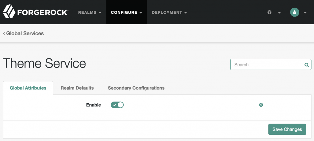
The Enable switch allows you to turn on/off all theming provided by this service. The meat is under Secondary Configurations:
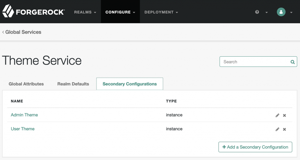
Each theme definition consists of a number of settings:
Theme
Select any of the beautifully styled theme designs by Linh Nguyen. These defaults are always a safe bet.
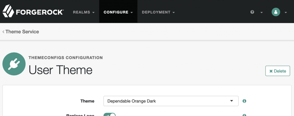
Besides the six theme designs, you can also select None or Custom:
- None
- Confident Blue Dark
- Dependable Orange Dark
- Fresh Orange
- Harmonious Red
- Soothing Blue
- Trustworthy Green
- Custom
Use None if you want to keep using the default ForgeRock theme or if you have deployed a custom theme already. In that case, Theme Node will not overwrite all that you have done but will allow you to make pointed little modifications like tweak individual elements of your theme and change the Log In button text or change the footer text without requiring you to re-deploy your UI.
Use Custom if none of the pre-defined designs work for you and you are a CSS wizard like Linh yourself. In that case, you can upload your own CSS definitions in the Custom Theme section and dynamically apply them using Theme Node.
Replace Logo
One of the first things most people want to do is either get rid of the default ForgeRock logo or at least replace it with the new colors. Either task can be accomplished through the Replace Logo and Logo Properties settings.
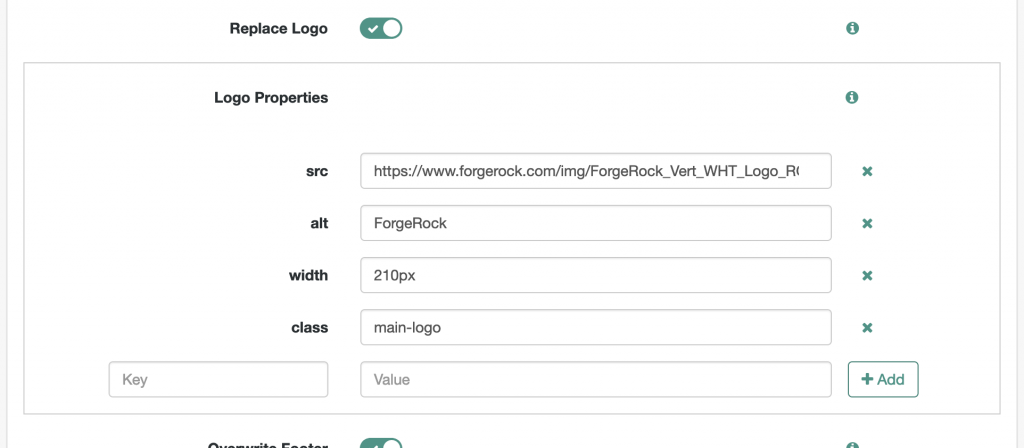
If Replace Logo is enabled, the Logo Properties settings are applied.
Specify any number of properties defining the new logo’s <img> tag. At a minimum you must supply a src key and a value pointing to your new logo. If you do not provide a src key entry, the existing logo is removed but not replaced. You can reference transient/shared state variables anywhere in your values using the {{variable}} notation. Sample ForgeRock logos to use:
- Color (for light themes): https://www.forgerock.com/img/ForgeRock_Vert_Color_Logo_RGB_R_med.svg
- White (for dark themes): https://www.forgerock.com/img/ForgeRock_Vert_WHT_Logo_RGB_R_med.svg
Overwrite Footer
I have to admit I am a bit OCD when it comes to this, but I don’t like presentations with last year’s copyright statements and I am appalled by websites with outdated copyright statements. The impression I am getting is: This presentation is copied & pasted old content, this site isn’t current. Want to keep the copyright current in all your flows? Here is how you do it.

If Overwrite Footer is enabled, the Footer Text settings are applied. Add any number of localized footer texts to the list. You can reference transient/shared state variables anywhere in your text using the {{variable}} notation.
Custom Theme
If none of the pre-defined theme designs work for your environment (which will be a common situation for non-ForgeRock employees) then you are free to create your own designs and use those in exactly the same way as you would use the included designs.
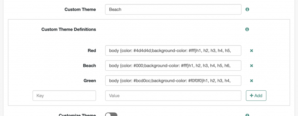
Specify the name of the custom theme to use. For this setting to take effect you must:
- Select Custom from the Theme list.
- Create a theme definition by adding a unique name as the key and valid CSS declarations as the value to the Custom Theme Definitions list.
- Identify the custom theme you want to use by name in this field.
Custom Theme Definitions are define using a key, which holds a unique name and a value, which must contain a valid block of CSS declarations making up the theme. You can reference transient/shared state variables anywhere in your style declaration using the {{variable}} notation. To make getting started easier, a few samples are pre-populated.
Customize Theme
I know, I know… this is a bit confusing. What’s the difference between Custom and Customize? Well, this section, Customize Theme, lets you further customize:
- The installed default or custom theme (which you may have installed by following the ForgeRock UI Customization Guide).
- A configured pre-defined theme from this Theme Service.
- A custom theme from this Theme Service.
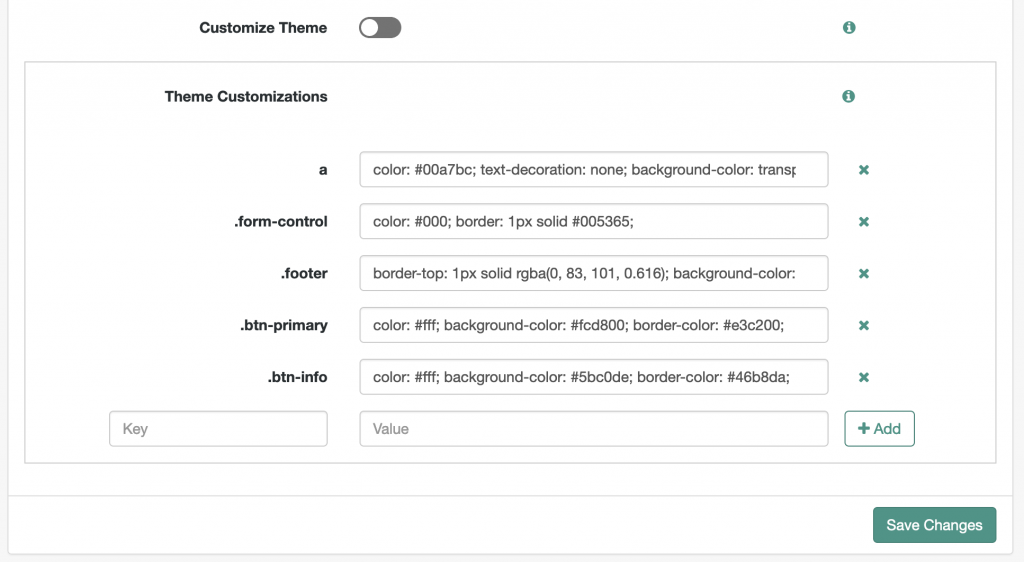
Settings in this section trump all the other settings. They are applied last and as inline styles. Use this section to apply tweaks to your themes without having to redeploy or update your main theme definitions.
Specify any number of properties. The key holds a CSS Selector expression and the value an inline style declaration. You can reference transient/shared state variables anywhere in your style declaration using the {{variable}} notation.
Theme Node Configuration
While the Theme Service configuration applies across many instances of the Theme Node, there are options that typically apply only for a particular instance. E.g. in most cases it does not make sense to globally overwrite the login button text. Or, one may want to render an individual page in a flow in a specific theme to grab the user’s attention.
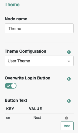
Theme Configuration
Select the theme from the drop-down list you want the Theme Node to apply to the current page. The list is populated dynamically by scanning the current realm’s Theme Service and the global Theme Service.
Overwrite Button
Enable this option to overwrite the default login button text. Specify localized texts. You can reference transient/shared state variables anywhere in your text using the {{variable}} notation. E.g. in a registration flow you may want the button to say “Register” or “Next” in a multi-page flow.
How To Use The Theme Node In Trees
Finally! You have configured your themes at the global and the realm level and are ready to bring some color into your flows. Here is how to go about it:

The easiest way to apply themes to your flows is to structure your flows to consistently use page nodes, even if there is only one input node inside the page node. That is going to be the best practice starting with the 7.0 release of the ForgeRock Identity Platform anyway, as all the ForgeRock SDKs are optimized to use page nodes and they allow you to keep things clean when designing your trees.
Once you have all the page nodes in place, simply drop a Theme Node into each one of them and select the Theme Configuration and optionally specify what you want to overwrite the default button with.
The one thing to watch out for is that if you are using nodes with multiple exits, those nodes have to be the last one inside a page node, meaning you have to add the Theme Node before those multi-exit nodes. Otherwise you are free to choose the order as you like. The sample tree depicted above demonstrates this.

Great work to make the FR solution even easier to customize for those of us HTML challenged!